Theme Tab (Global Settings)
The Theme tab in FMX Global Settings controls the visual appearance of your photo booth experience, including colors, branding, asset management, and UI text customization. All theme changes are previewed immediately in the running application, but are only persisted to disk when you click Save Changes.
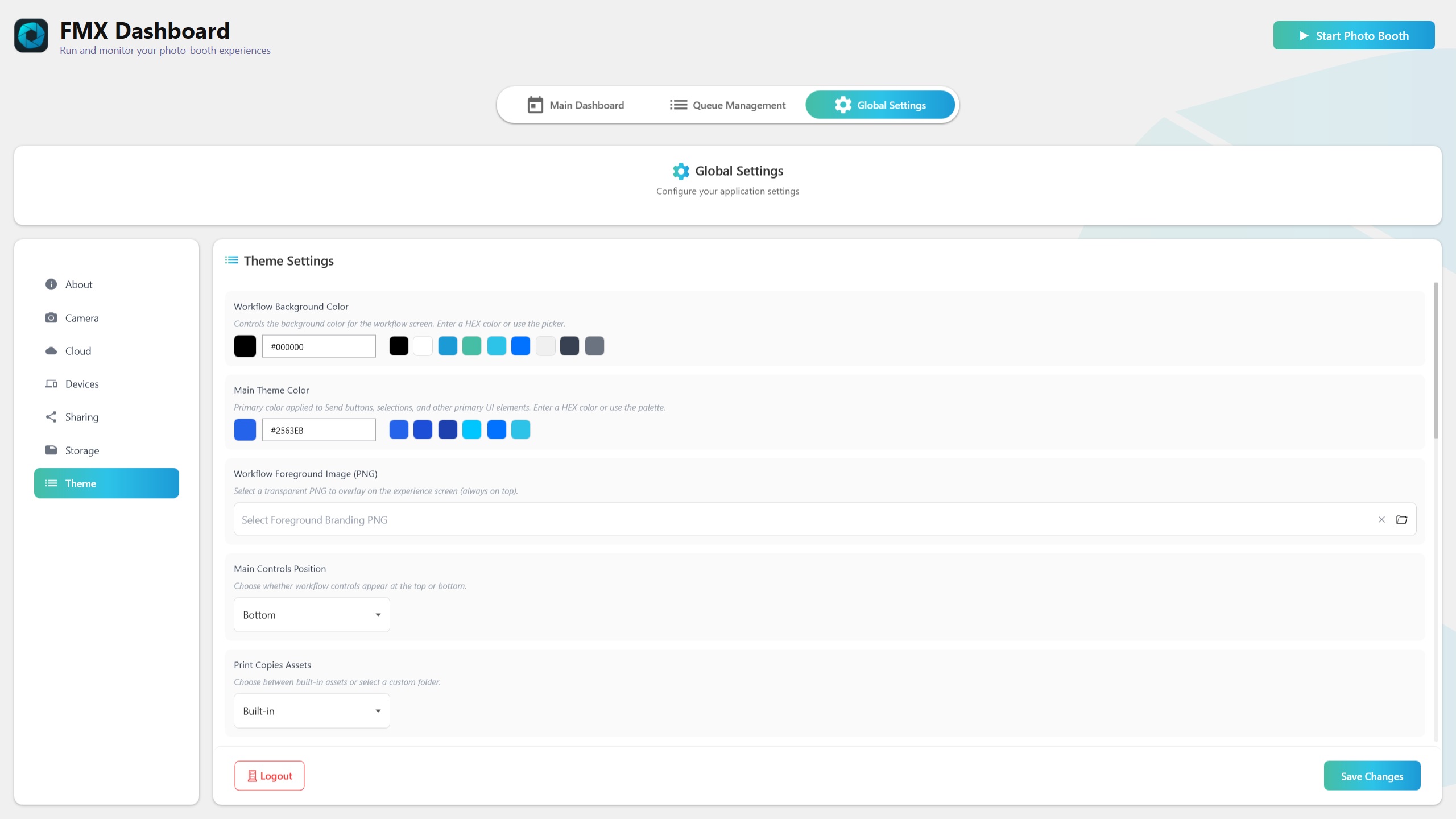
Workflow Background Color
- Background Color -- Sets the background color for the workflow experience screen. Enter a value in HEX format:
#RGB-- Shorthand (e.g.,#F00for red)#RRGGBB-- Full color (e.g.,#FF5733)#AARRGGBB-- With alpha transparency (e.g.,#80FF5733for semi-transparent)
Main Theme / Accent Color
- Main Theme Color -- Controls the primary accent color used throughout the FMX interface. This color is applied to primary buttons, selection highlights, active tab indicators, and other interactive elements. Enter a HEX color value.
Tip: Choose an accent color that matches your brand or the event theme. High contrast between the accent color and background improves readability and gives the booth a polished appearance.
Asset Management
The current Theme tab exposes these asset groups. Each group can operate in one of two modes:
- Built-in -- Uses the default assets bundled with FMX. No setup required.
- Customize -- Uses your own files or folder.
Asset Categories
| Category | Custom Input | Notes |
|---|---|---|
| Print Copies Assets | Folder | Assets used by the print-copies step |
| Signature Stamps Assets | Folder | PNG stamp assets used by signature/sign-draw workflows |
| Preview Theme Assets | Folder | Preview UI images; customized preview assets require retake.png and ok.png |
| Tic Tac Toe Assets | PNG files | Separate square PNG files for X and O marks |
Workflow Foreground Image
- Workflow Foreground Image (PNG) -- Select a transparent PNG image that is displayed over the experience screen during operation. Use this for watermarks, logos, sponsor branding, or event-specific graphics.
The overlay is rendered on top of the live experience but does not affect captured media (photos and videos are captured without the overlay unless you configure it as part of your workflow overlays).
Tip: Design your branding overlay with transparency so it does not obscure the camera preview or guest interface elements. Place logos in corners or along edges for a professional look.
Keyboard Settings
- Virtual Keyboard Layout -- Choose the on-screen keyboard layout used for email and survey text input: QWERTY (default) or AZERTY (FR).
- Survey Keyboard Language -- Choose the Open-Ended Survey keyboard language: English, Spanish, French, or Hebrew.
UI Text Translations
FMX allows you to customize every text string displayed in the application by defining key-value translation pairs. This is useful for localizing the booth into different languages or simply adjusting the wording to match your brand voice.
Available Actions
- Add Blank -- Adds an empty key-value pair for you to fill in manually. Use this only when you know the exact text key name.
- Add Common Keys -- Seeds the translation list with the most frequently customized text keys and their default values. This is the recommended starting point -- it shows you which keys are available and lets you edit only the ones you want to change.
- Edit -- Modify the value of an existing key-value pair.
- Remove -- Delete a key-value pair, reverting that text back to the built-in default.
Tip: Start by clicking Add Common Keys to see the popular text strings. From there, edit only the entries you want to customize. You do not need to define every key -- any key not in your translation list uses the FMX default text.
Main Controls Position
- Top (default) -- Places the primary navigation controls at the top of the experience screen.
- Bottom -- Moves the primary navigation controls to the bottom. Use this when your booth layout places the screen lower and guests interact near the bottom of the display.
Save Behavior
Theme settings follow the same preview-then-save model as all Global Settings:
- Changes to colors, assets, and text translations are applied to the running application immediately for preview.
- Changes are only written to disk when you click Save Changes at the bottom of the panel.
- If FMX closes before you save, unsaved theme changes are lost.
See also: Storage Tab
Was this helpful?
Related articles
FMX for Windows: Customizing Your Experience
Everything at a photo booth event — the overlays, the countdown, the on-screen text, the email guests receive, the gallery they get a link to — is something you control. This guide
FMX for Windows: System Requirements
Before installing FMX on your Windows computer, make sure your system meets the requirements below. Meeting the recommended specifications will ensure smooth performance during eve
Installing FMX on Windows
When to Use First-time installation of FMX on a Windows PC Reinstalling FMX on the same machine Upgrading FMX to a newer version using the latest installer Requirements Windows 10
Building a FMX Preset From Scratch: Video Tutorial
This video covers the basics of building a workflow and layout in FMX — a good starting point before exploring the individual workflow step articles.
Run the Experience
When to Use After FMX is installed, you are logged in, your event is synced, and your camera choice is set. Requirements FMX opens on the Main Dashboard. Event synced and up to dat