
FMShare for iPad: Branding Tab
The Branding tab is where you make FMShare look like your client's event instead of a stock app. It holds four cards: Background, System Icons Theme, Event Title, and Media Border.
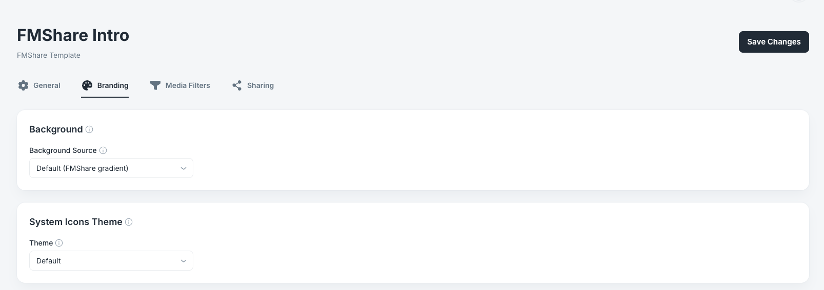
Note: Most settings on this tab stay hidden until you turn something on. A preset at its defaults looks almost empty, which is normal. Change Background Source to Photo, or a toggle to On, and the related controls appear beneath it.
Background
This card controls the backdrop behind the photo wall.
Background Source
Options: Default (FMShare gradient), Photo, Color Fill. Default: Default (FMShare gradient).
Default (FMShare gradient) uses the built-in Foto Master gradient. It is a safe choice and needs no further setup.
Photo lets you upload a custom image, which is the option to use for a client's branded backdrop or a step-and-repeat design.
Color Fill paints a solid color or a two-color gradient. Use this when you want to match a client's brand color exactly without designing an image.
Selecting Photo or Color Fill reveals additional controls, covered below.
If You Choose Photo
Background Image Accepted formats: JPEG, PNG, GIF, WebP, BMP. Maximum size: 5 MB. Default: None.
Upload your image here. It is downloaded and cached on the iPad during Sync Event, then stored with the event, so it survives restarts.
Fill Mode Options: Fit, Fill, Crop. Default: Fill.
How your image is scaled to the iPad screen. Fit shows the whole image and may leave bars at the edges. Fill stretches it to cover the screen, which can distort it. Crop covers the screen and trims the overflow.
Design your background at the iPad's screen proportions and Fill will look correct without distortion. If you are reusing a client's logo file or a print asset, use Fit so nothing important is cut off or stretched.
Note: If the background image fails to download during sync, the gallery falls back to the FM gradient. If a client's backdrop is missing at an event, that is the first thing to check.
If You Choose Color Fill
Fill Style Options: Solid, Gradient. Default: Gradient.
Whether the background is one flat color or a two-color blend.
Color (shown when Fill Style is Solid) Default: Dark teal (#052930).
Gradient Start and Gradient End (shown when Fill Style is Gradient) Defaults: Teal (#37C2D2) and cyan (#00BCE9).
Keep backgrounds dark. The photo wall sits on top of this, and a light or busy background competes with the guests' photos and makes white borders and titles disappear.
System Icons Theme
This is the most commonly missed card on the tab, because its name does not tell you how far it reaches.
Theme
Options: Default, Custom. Default: Default.
Default uses FMShare's standard colors.
Custom unlocks three color controls that apply to all of the following:
- The sharing screens guests see after tapping Email, SMS, QR, AirDrop, or Print.
- The disclaimer screens shown before Email and SMS sharing.
- The media filter buttons at the bottom of the gallery.
The Custom Colors
Text Color Default: White. Text, symbols, and the disclaimer controls.
Background Color Default: Black. The background of the sharing screens and controls.
Send Button Color Default: FM cyan (#00BCE9). The Send and Done buttons. FMShare preserves its gradient styling on these buttons using the color you pick.
Note: There are no separate color settings for the disclaimer screens. If a client asks you to restyle the disclaimer, this card is where you do it.
Check the contrast between Text Color and Background Color before an event. Guests will be typing an email address on this screen in a dim venue, and low-contrast branding makes that hard.
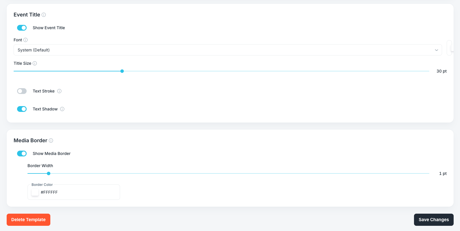
Event Title
This card styles the event name drawn over the gallery.
Show Event Title
Options: On, Off. Default: On.
Shows the event's name above the gallery. Turning it off hides the title and gives that space back to the photo wall, and it also hides every setting below it.
Turn it off when the client's branded background already includes the event name, which would otherwise appear twice.
Font
Options: System (Default), Inter, Rounded, Serif, Monospaced, Roboto, Montserrat, Poppins, Poppins Bold, Playfair Display, Merriweather, Oswald, Pacifico, Lobster, Noto Sans Hebrew, Noto Sans Arabic. Default: System (Default).
Sixteen typefaces are available. Playfair Display and Merriweather suit formal weddings, Poppins and Montserrat suit corporate events, and Pacifico and Lobster suit casual parties.
Use Noto Sans Hebrew or Noto Sans Arabic for event names in those scripts. The other fonts will not render those characters correctly.
Title Color
Default: White.
The color of the title text.
Title Size
Range: 18 to 64 pt. Default: 30 pt.
Set with a slider, and the current value is shown at the right end.
Very long event names shrink slightly on their own to fit the screen, so you do not need to compensate for a long name manually.
Text Stroke
Options: On, Off. Default: Off.
Adds an outline around each letter. Turning it on reveals Stroke Width (0.5 to 5 pt, default 1.5 pt) and Stroke Color (default black).
This is the fix for a title that disappears over bright photos. A white title with a thin black stroke stays readable over any background.
Text Shadow
Options: On, Off. Default: On.
Adds a soft shadow behind the title.
Leave this on. It is subtle, it costs nothing visually, and it is what keeps a white title legible when a bright photo scrolls underneath it.
Media Border
Show Media Border
Options: On, Off. Default: On.
Draws a border around every tile in the gallery. Turning it off hides the two settings below.
Borders separate photos from each other and from the background. Turn them off only when you want an edge-to-edge mosaic look.
Border Width
Range: 0.5 to 10 pt. Default: 1 pt.
Set with a slider. The default of 1 pt gives a clean separation without drawing attention to itself. Anything above 4 pt starts to look like a deliberate frame, which can suit a formal event but eats into the photo.
Border Color
Default: White (#FFFFFF).
Entered as a hex value with a color swatch beside it.
Match the border to the background contrast, not to the client's brand color. A white border on a dark background reads cleanly. A white border on a light custom background disappears entirely.
Saving Your Changes
Click Save Changes at the top right or the bottom right of the page. Both buttons do the same thing.
The red Delete Template button sits at the bottom left.
Seeing Your Changes on the iPad
Branding changes are the easiest to verify, because most of them are visible the moment the gallery opens.
- On the iPad, open the FMShare Dashboard and select the Events tab.
- Spin the wheel to your event.
- Tap Sync Event and wait for Sync complete in green.
- Tap the play button to open the gallery.
Check these four things in order:
- The backdrop behind the wall shows your gradient, image, or color fill.
- The event title appears with your font, size, color, stroke, and shadow.
- The tile borders match your width and color.
- Tap any photo, then tap a share icon to check your System Icons Theme colors. This is the one that is easy to forget, because you cannot see it from the gallery alone.
Note: A custom background image is downloaded during sync. If the gallery shows the FM gradient instead of your image, the download failed. Sync again on a stable connection.
Note: If several iPads are running this event, press Sync Event on each one and each iPad requires its own License.
And you're good to go!
Was this helpful?
Related articles
FMShare for iPad: Overview
FMShare turns an iPad into a live sharing station for your event. It shows a continuously updating gallery of the event's photos, videos, and GIFs, and lets guests send items to th
FMShare for iPad: System Requirements
FMShare for iPad requires an iPad running iPadOS 17 or later.Supported DevicesFMShare is intended for modern iPad models that support iPadOS 17.For best results, use an iPad with e
FMShare for iPad: General Tab
FMShare's look is built in the Foto Master Cloud, not on the iPad. This article covers the General tab of an FMShare preset, where you name the template and choose how your gallery
FMShare for iPad: Media Filters Tab
The Media Filters tab holds two cards: Filter Tabs, which controls what guests can tap, and Media Types, which controls what the iPad downloads at all. They sound similar and they
FMShare for iPad: Sharing Tab
The Sharing tab decides how guests get their photos. It holds four cards: Sharing Actions, Action Bar, Email Disclaimer, and SMS Disclaimer. Sharing Actions Each sharing action can