
Selection Screen: Background Media
The Selection Screen transforms an image or looping video into an interactive menu. Guests can choose a workflow path, prompt, Photo Layout, Video Fusion template, paid package, or a Mixed combination of those actions. A Photo Layout screen can also collect several choices with Multi Area Selection.
Background Media
Before using a Selection Screen, you need to prepare your Background Media.
Background Media is a video (MP4/MOV) or image (PNG/JPG) that you select in the Selection Screen Editor. It acts as the visual interface under the interactive tap areas.
For optimal display, use the dimensions specified in the Custom Assets: Dimensions and Format Specifications article.
You can design your background media using free tools like Photopea or Canva, giving you full flexibility to create a custom, on-brand interface for your workflow.
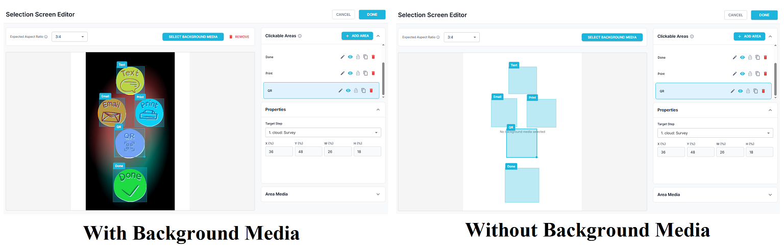
The image above shows the difference between using Background Media and having no Background Media in the Selection Screen Editor.
With Background Media (left)
A custom image or design sits behind the clickable areas, making the screen look polished and easy for guests to understand, because the tap zones visually match the design.
Without Background Media (right)
Only plain placeholder boxes are visible with no background design, making the screen look unfinished and less engaging.
Adding Background Media significantly improves the appearance and usability of the selection screen.
Configure the background for iPad
- Open the Selection Screen step in the Cloud Workflow Builder.
- Select Open Selection Screen Editor.
- Set Expected Aspect Ratio to 3:4 for a portrait iPad.
- Select Select Background Media and choose the image or video.
- Choose how it fits:
- Fit preserves the complete asset but can leave empty space.
- Crop fills the screen and can trim the edges.
- Stretch fills the screen and can change the asset's proportions.
- Place each clickable area over the matching visual button.
- Save, sync the event, and test the full screen on the actual iPad.
Designing for clickable areas
- Keep important artwork and text away from the very edge of the canvas.
- Make the visible buttons large enough for comfortable touch use.
- Make each hotspot slightly larger than its button artwork.
- Avoid overlapping areas unless the overlap is intentional.
- Use the same 3:4 artwork while positioning the areas; changing the ratio later can move taps away from the visible buttons.
- Use Area Media for independent thumbnails or previews that should sit above the background.
- On a Payment or multi-area Layout screen, leave room around a selected choice for its Selection Effect.
- On a Payment screen using Stripe or Shopify, reserve clear space for the optional Payment QR.
- On Multi Area Selection, include a clear Done visual in the background or add it as Area Media to the automatically created Done area.
Important: The eye icon beside an area hides it in the builder canvas only. The area and its media remain visible and tappable in FMX for iPad. Delete the area if it should not be available to guests.
Background Media versus Area Media
Use Background Media for the overall design, instructions, branding, and button positions. Use Area Media when each option needs a separate image or video, such as an AI example, product thumbnail, or layout preview.
The clickable-area name is primarily for organizing the editor. Put guest-facing labels in the background or Area Media.
For every Selection Type, including Mixed, Payment, and Multi Area Selection, see Selection Screen: Types, Mixed Menus, Payments, and Multi-Area Layouts. For tap alignment issues, see How to Troubleshoot a Selection Screen in FMX for iPad.
Was this helpful?
Related articles
FMX for iPad: Customizing Your Experience
Everything at a photo booth event (the look of the experience, the on-screen text, the animations, the email guests receive, what shows on the external display) is something you co
FMX for iPad: System Requirements
FMX for iPadOS is a native Swift application that delivers the full photo booth experience on Apple's iPad platform. Before installing, ensure your iPad meets these requirements. S
FMX for iPad: Main Dashboard
When something goes wrong with FMX for iPadOS, diagnostic logs and systematic troubleshooting are your best tools for identifying and resolving issues. This guide covers how to col
Installing FMX on iPad
Requirements Before You Start iPad running iPadOS 16 or later (iPadOS 17+ recommended) Apple ID with access to the App Store Active Foto Master Cloud account with an iPad license A
FMX for iPad: Sharing Methods
What Sharing Settings Control In FMX for iPad, guests can receive their photos via email, SMS, or QR code. Sharing Methods QR Code: displays a scannable QR code on the FMX screen a