
Selection Screen: Types, Mixed Menus, Payments, and Multi-Area Layouts
A Selection Screen turns an image or looping video into an interactive menu. You place clickable areas over the artwork, then decide what each area does when a guest taps it.
The same Cloud Workflow Builder is used for FMX for Windows and FMX for iPadOS. The important differences are the screen shape and the hardware or payment provider used at the event, so always test on the actual booth before going live.
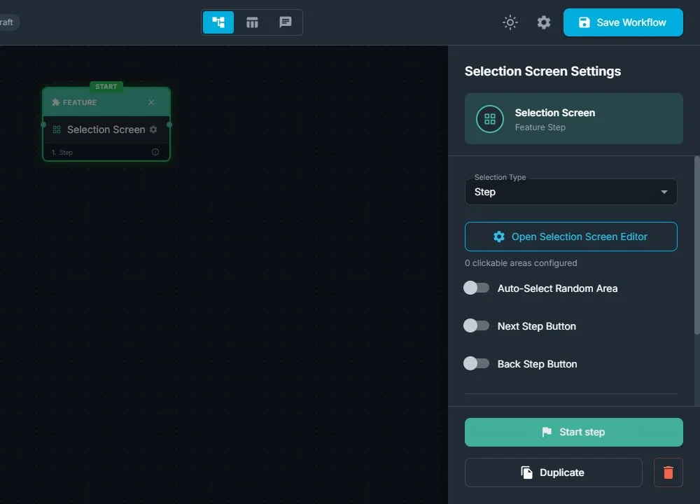
What a Selection Screen can do
The Selection Type determines whether all areas perform one kind of action or whether each area can do something different.
| Selection Type | What a tap does | Typical use |
|---|---|---|
| Step | Goes immediately to the area's Target Step | Choose Photo, Video, AI, or Sharing paths |
| Prompt | Stores the area's Prompt Text for a later AI step | Choose an AI style or scene |
| Photo Layout | Activates the area's selected layout | Choose one strip, collage, or print design |
| Video Fusion | Activates the area's selected Video Fusion template | Choose a video treatment |
| Workflow | Opens the area's selected workflow | Build a parent menu for several complete experiences |
| Payment | Starts payment for the area's price and continues to that area's step after approval | Sell packages, upgrades, or session quantities |
| Mixed | Lets each area be Step, Prompt, Photo Layout, Video Fusion, Workflow, or Payment | Combine paid and free choices, or different action types, on one menu |
Use a regular type when every option has the same purpose. Use Mixed when one screen needs different kinds of choices. For example, one area can start a free Photo workflow, another can load an AI prompt, and a third can charge for a premium Workflow.
Important: Changing Selection Type clears the screen's clickable areas. Choose the type before spending time positioning and styling the areas.
Build a basic Selection Screen
- Add a Selection Screen feature step to the workflow.
- Choose its Selection Type.
- Select Open Selection Screen Editor.
- Set Expected Aspect Ratio to match the device:
- For FMX for iPadOS in portrait, use 3:4.
- For FMX for Windows, match the booth display, such as 9:16, 16:9, 4:3, 3:4, 2:3, 3:2, or 1:1.
- Choose Select Background Media, then select an image or looping video.
- Choose how the background fits:
- Fit preserves the full image and can leave empty space.
- Crop fills the screen and can trim the edges.
- Stretch fills the screen but can change the media's proportions.
- Select Add Area for every guest choice.
- Drag and resize each area over the matching button or visual in the background. For precise placement, edit X, Y, W, and H as percentages.
- Select each area and complete its action in Properties.
- Optionally add an image, video, or AI-generated example in the area's Media tab.
- Select Done in the editor, save the workflow, sync the event in FMX, and test every path.
Clickable areas are transparent at runtime unless they contain Area Media or are showing a Payment or multi-area Selection Effect. An area's name helps you organize the editor; do not rely on the name itself as guest-facing artwork. Put instructions and choice labels in the background or Area Media.
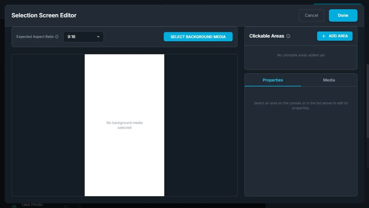
Area controls explained
Each row under Clickable Areas includes controls that affect editing:
| Control | What it does |
|---|---|
| Rename | Gives the area a clear editor name such as Premium $20 or Classic + Color |
| Eye | Hides or shows the rectangle on the builder canvas only |
| Lock | Prevents accidental dragging or resizing in the builder only |
| Duplicate | Copies the area, including its action and media, so you can reposition it |
| Delete | Removes the area from the screen |
Warning: the eye icon does not disable a guest choice. An area hidden in the editor is still rendered, tappable, and eligible for random choice, Payment, and multi-area selection in FMX. Delete an area if guests must not be able to use it. Lock it if you only want to protect its position while editing.
How to configure each area action
For a regular Selection Type, every area uses that type automatically. A Mixed screen also shows Area Type, where you choose the action separately for the selected area.
| Area Type | Required setting | What happens next |
|---|---|---|
| Step | Target Step | The selected branch opens immediately |
| Prompt | Prompt Text | The prompt is saved and the screen uses its normal workflow continuation |
| Photo Layout | Photo Layout | The layout becomes active, then the screen uses its normal continuation |
| Video Fusion | Video Fusion | The template becomes active, then the screen uses its normal continuation |
| Workflow | Workflow | The selected child workflow opens |
| Payment | Price and Continue to Step | Payment starts; approval opens that area's continuation step |
A Mixed screen can use all six area types at once. It cannot use the special multi-area Done action. If you change an area's Area Type, recheck its target because the settings for the previous action are replaced.
Avoid dead ends on Mixed screens
Step and Payment areas carry their own destination. Prompt, Photo Layout, and Video Fusion choices apply a value and then follow the Selection Screen's normal outgoing connection. Make sure that normal continuation exists when the screen contains any of those area types.
For example:
- Classic Photo: Step →
Live View - AI Superhero: Prompt →
Take Photo, through the screen's normal continuation - Premium Video: Payment
$15→Premium Video Workflow
Test every choice separately. A Step branch working correctly does not prove that a Prompt or Layout area's normal continuation is connected.
Payment Selection Screens
A Payment Selection Screen is a live payment gate. Each area has its own Price and Continue to Step.
Initial Selection
| Option | Guest experience |
|---|---|
| Nothing selected | The screen waits. No payment starts until the guest taps a price. This is the default. |
| First area selected | The first complete price area is marked and payment is armed when the screen opens. A preselected free $0.00 area still waits for a tap. |
When a guest changes from one paid option to another, FMX safely replaces the active payment attempt with the new amount. After approval, FMX continues automatically to the step assigned to the price that was actually charged. There is no separate Next-to-pay action.
Selection Effects
Use Selection Effect to show which price is active. The options are:
- None (invisible)
- Border
- Glow
- Spinning Border
- Scan Line
- Marching Ants
- Shimmer
- Breathe
- Corner Brackets
Choose the color and intensity, and choose Slow, Normal, or Fast for animated effects. The screen setting is the default. Turn on Override in an area's Properties to give one price a different effect.
Payment QR
Turn on Payment QR in the editor to reserve a QR-code position. Move and resize the purple placeholder just like an area. FMX draws the real QR as a square centered inside that rectangle.
The placed QR works with Stripe and Shopify payment providers. Other providers ignore the placeholder. With Nothing selected, the QR appears after the guest taps a paid area. With First area selected, it can appear immediately. Repricing generates a new QR for the new amount, and a $0.00 choice does not show one.
For provider setup, see Stripe QR Checkout Payments in FMX or Shopify QR Checkout Payments in FMX.
See Payment Type Selection Screens for a complete payment setup and troubleshooting guide.
Multi Area Selection for Photo Layouts
Multi Area Selection lets a guest choose several items and maps the exact combination to one Photo Layout. This is useful for designs such as:
- Pick any two characters and receive a two-character collage.
- Pick three products and load a matching branded layout.
- Pick two poses, backgrounds, or team members and use a layout designed for that pair.
This feature is available only when Selection Type is Photo Layout. It is different from Mixed: Mixed runs one action from one tap, while Multi Area Selection collects several layout choices before continuing.
Configure Multi Area Selection
- Set Selection Type to Photo Layout.
- Turn on Multi Area Selection.
- Choose Areas to select, from 2 through 8.
- Add at least one more selectable area than the required count. For example, selecting 2 requires at least 3 choices. The maximum is 9 selectable areas.
- Rename the areas clearly. These names appear in the combination list and make mapping easier.
- Add Media to each choice or include the choice artwork in the background.
- Configure the automatically created green Done area. Choose Top Left, Top, Top Right, Left, Center, Right, Bottom Left, Bottom, or Bottom Right, or drag it to a custom position.
- Open Combinations and assign a Photo Layout to every listed combination.
- Add a visual for the Done area, either as Area Media or in the background artwork.
- Save only after the editor shows no unmapped combinations.
The combination is based on the selected areas, not their tap order. Alex + Sam loads the same layout whether the guest taps Alex first or Sam first.
Use Assign to all unmapped when several combinations should use one common layout. Assign each row separately when every combination has a specially designed layout. Be deliberate when adding many areas: 5 choices taken 2 at a time create 10 mappings, while 9 choices taken 4 at a time create 126 mappings.
Guest behavior
- A tap selects an area; tapping it again deselects it.
- Several selected areas can show their effects at the same time.
- Once the required count is reached, extra choices are ignored until the guest deselects one.
- Done becomes active only when exactly the required number is selected and that combination has a layout mapping.
- Tapping active Done loads the mapped Photo Layout and follows the screen's normal continuation.
- The chosen layout stays active for later Save Final Photo, printing, and sharing steps.
Multi Area Selection turns off Auto-Select Random Area, Next, Back, and swipe navigation. The Done area is the only guest confirmation control.
Initial Selection and effects
Choose Nothing selected to start with no choices. Choose First area selected to start with the first selectable area already picked; it counts toward the required total and the guest can deselect it.
Selection Effects use the same nine styles available for Payment. The screen effect is the default for all selectable areas, while individual choices can use Override. The Done area never shows a selection effect.
Do not hide multi-area choices with the eye icon. The eye affects the builder canvas only; FMX still treats the area as a live choice. Keep all choices visible while assigning combinations, and delete any choice that should not run.
Auto-Select Random Area
Turn on Auto-Select Random Area when FMX should choose a complete area without showing the menu. It is useful for surprise prompts, rotating layouts, and randomized workflows.
The option is not available on a Payment screen and is disabled by Multi Area Selection. It is available on Mixed screens, where any complete area can be chosen, including a Payment area. Use it on Mixed only when every possible random action, price, and destination is acceptable.
Next, Back, and swipe navigation
Regular, non-random Selection Screens can link to other Selection Screen pages:
- Next Step Button and Back Step Button show navigation controls.
- Their target lists contain other Selection Screen steps.
- Transition Type can be Buttons Only, Swipe Only, or Button + Swipe.
These controls are for paging between menu screens; they do not replace an area's action or the workflow's normal continuation. Payment has no Next-to-pay button, and Multi Area Selection uses its Done area instead of Next or Back.
Area Media
Area Media lets the option carry its own image or looping video. In the Media tab you can:
- Select Media from the asset library.
- Upload Media and apply it to the area.
- Use AI Generation with AI Draw Me or AI Modify to produce an example image.
Area Media is contained inside the area's rectangle, so size the rectangle for both easy tapping and a clean preview. For detailed instructions, see Using Area Media on Selection Screens.
Pre-event checklist
- Choose the final Selection Type before placing areas.
- Use 3:4 for a portrait iPad; match the actual display on Windows.
- Put guest-facing text in the background or Area Media.
- Make touch areas comfortably larger than the visible button artwork.
- Delete unused areas instead of hiding them with the eye icon.
- Give every Mixed Step and Payment area a valid destination.
- Give Prompt, Layout, and Video Fusion choices a normal continuation.
- Map every multi-area combination and add a clear Done visual.
- Configure and test the actual payment provider before testing Payment areas.
- Save, sync the event, and test every area on the physical Windows booth or iPad.
For a practical walkthrough, continue to Setting up a Selection Screen. For iPad alignment problems, see How to Troubleshoot a Selection Screen in FMX for iPad.
Was this helpful?
Related articles
FMX for Windows: Customizing Your Experience
Everything at a photo booth event (the overlays, the countdown, the on-screen text, the email guests receive, the gallery they get a link to) is something you control. This guide m
FMX for Windows: System Requirements
Before installing FMX on your Windows computer, make sure your system meets the requirements below. Meeting the recommended specifications will ensure smooth performance during eve
Installing FMX on Windows
When to Use First-time installation of FMX on a Windows PC Reinstalling FMX on the same machine Upgrading FMX to a newer version using the latest installer Requirements Windows 10
Login to FMX
When to Use Immediately after installing FMX When switching operators or moving the license to a different PC Requirements A Foto Master Cloud Account (email and password) At least
Building a FMX Preset From Scratch: Video Tutorial
This video covers the basics of building a workflow and layout in FMX: a good starting point before exploring the individual workflow step articles.